CSS displayの書き方・一覧【23種説明】

CSSのdisplayを使うことでhtmlタグの本来の動きを変化させることができます。
displayで使える値はたくさんあります。ただし、以下で紹介する23種が現実なところでしょう。
CSS displayの書き方を23種デモ付きで全部説明します!
目次
利用頻度の高いdisplay
利用頻度の高いdisplay5つを紹介します。
この5つを覚えておけば他のdisplayは覚えなくても困りません。
display:block
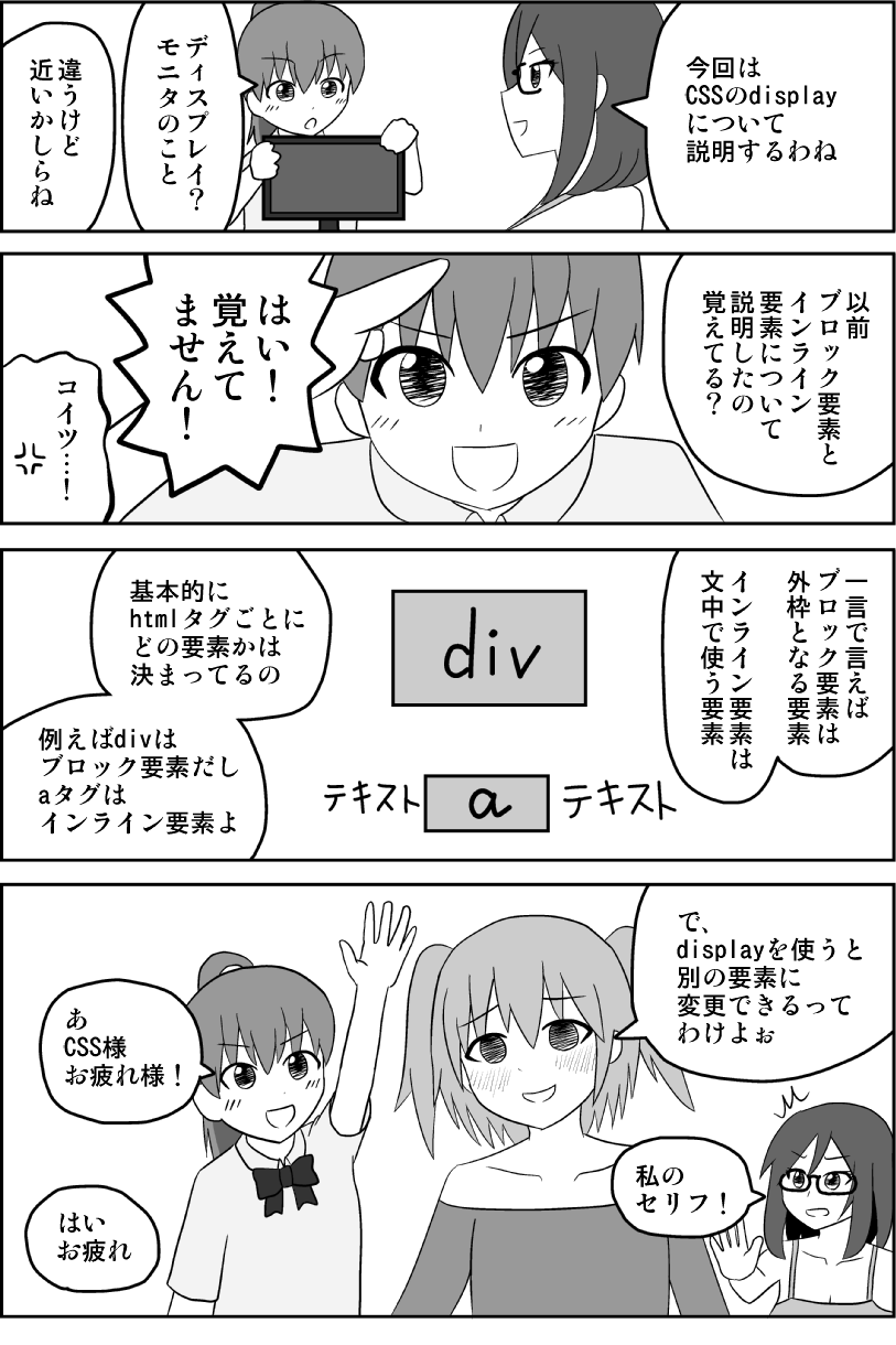
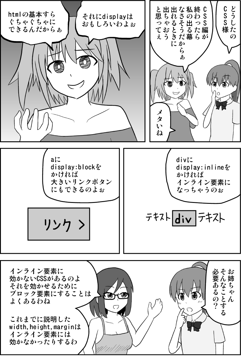
divを代表とするブロック要素にするCSSです。
特徴
- 箱として扱われる
- 兄弟要素を縦に配置する
- widthを指定しない場合横幅いっぱいになる
<style>
.block>span{
	display: block;
	border: 1px solid #000;
	padding: 10px;
	background: #f2f2f2;
}
</style>
<div class="block">
	<span>display: block</span>
	<span>display: block</span>
	<span>display: block</span>
</div>
ブロック要素・インライン要素って何?というかたはこちら↓

display:inline
spanを代表とするインライン要素にするCSSです。
特徴
- テキストと同様に扱われる
- 兄弟要素を横に配置する
- widthは指定できない(子要素の最小値になる)
<style>
.inline>div{
display: inline;
border: 1px solid #000;
padding: 10px;
background: #f2f2f2;
width: 100px;
}
</style>
<div class="inline">
<div>display: inline</div>
<div>display: inline</div>
<div>display: inline</div>
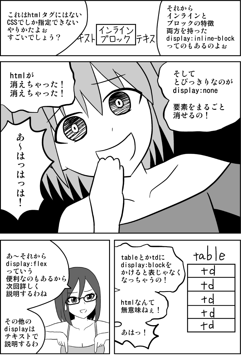
</div>display:inline-block
ブロック要素の特徴を持ちつつインライン要素の特徴を合わせ待ったCSSです。
特徴
- 箱として扱われる
- 兄弟要素を横に配置する
- widthを指定できる。指定しない場合、子要素の最小値になる
<style>
.inline-block>div{
	display: inline-block;
	border: 1px solid #000;
	padding: 10px;
	background: #f2f2f2;
	width: 100px;
}
</style>
<div class="inline-block">
	<div>display: inline-block</div>
	<div>display: inline-block</div>
	<div>display: inline-block</div>
</div>
display:none
指定したhtml要素とその子孫要素すべてを消します。display:blockとセットで使われることが多いです。
消えるのでデモの表示のしようがありません。
ソースだけお見せします。
<style>
.none{
	display: none;
}
</style>
<div class="none">display: none</div>
display:noneの要素にそれ以外のdisplayを上書きで指定すると表示されるようになります。
display:flex
横並びや上下左右中央寄せなどレイアウトに関する調整ができるCSSです。
非常にたくさんのことができるので下記記事でご確認ください。
特徴
- レイアウト調整に用いられる
- 横並びなどができる
- display:flexは横並べにしたい要素の親要素に指定する
<style>
.flex{
display: flex;
}
.flex>div{
border: 1px solid #000;
padding: 10px;
background: #f2f2f2;
width: 100px;
}
</style>
<div class="flex">
<div>display: flex</div>
<div>display: flex</div>
<div>display: flex</div>
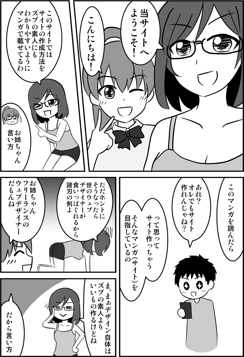
</div>CSSやhtmlの基本をしっかり理解すると、この記事の内容もより理解できるようになりますよ。
↓CSSやhtmlを楽しく学べるようにマンガを描きましたのでゼヒご覧ください↓

↑「副業してもう少し稼ぎたい!」というかたのために副業の方法も解説しています。
table関連display
htmlのtable関連タグと同じ効果を得ることができます。
一覧
左列のdisplayで指定すると右列のhtmlと同じ要素となります。
| display(CSS) | html |
|---|---|
| table | table |
| table-caption | caption |
| table-column-group | colgroup |
| table-column | col |
| table-header-group | thead |
| table-row-group | tbody |
| table-row | tr |
| table-cell | td |
| table-footer-group | tfoot |
thにあたるdisplayはないため「table-cell」にCSSで調整しましょう。
実際にhtmlでつくった表とCSSdisplayで作った表を見比べてみましょう
html版
| タイトル1 | タイトル2 | タイトル3 |
|---|---|---|
| その1 | 1 | 2 |
| その2 | 3 | 4 |
| その3 | 5 | 6 |
| 合計 | 9 | 12 |
<table>
  <caption>
  表のタイトル
  </caption>
  <colgroup>
	  <col span="1" style="width:100px; background:#FF3300;">
	  <col span="2" style="background:#FFCC00;">
  </colgroup>
  <thead>
    <tr>
      <th>タイトル1</th>
      <th>タイトル2</th>
      <th>タイトル3</th>
    </tr>
  </thead>
  <tbody>
    <tr>
      <th>その1</th>
      <td>1</td>
      <td>2</td>
    </tr>
    <tr>
      <th>その2</th>
      <td>3</td>
      <td>4</td>
    </tr>
    <tr>
      <th>その3</th>
      <td>5</td>
      <td>6</td>
    </tr>
  </tbody>
  <tfoot>
    <tr>
      <th>合計</th>
      <td>9</td>
      <td>12</td>
    </tr>
  </tfoot>
</table>
CSS版
<style>
	.table{
		display: table;/*table*/
		border-spacing: 2px;
	}
	.table-caption{
		display: table-caption;/*caption*/
		text-align: center;
	}
	.table-column-group{
		display: table-column-group;/*colgroup*/
	}
	.table-column{
		display: table-column;/*col*/
	}
	.table-header-group{
		display: table-header-group;/*thead*/
	}
	.table-row-group{
		display: table-row-group;/*tbody*/
	}
	.table-row{
		display: table-row;/*tr*/
	}
	.table-cell{
		display: table-cell;/*td*/
		padding: 1px;
	}
	.table-cell-th{
		display: table-cell;/*td*/
		text-align: center;
		font-weight: bold;
		padding: 1px;
	}
	.table-footer-group{
		display: table-footer-group;/*tfoot*/
	}
</style>
<div class="table">
  <div class="table-caption">
  表のタイトル
  </div>
  <div class="table-column-group">
	  <div class="table-column" style="width:100px; background:#FF3300;"></div>
	  <div class="table-column" style="background:#FFCC00;"></div>
	  <div class="table-column" style="background:#FFCC00;"></div>
  </div>
  <div class="table-header-group">
    <div class="table-row">
      <div class="table-cell-th">タイトル1</div>
      <div class="table-cell-th">タイトル2</div>
      <div class="table-cell-th">タイトル3</div>
    </div>
  </div>
  <div class="table-row-group">
    <div class="table-row">
      <div class="table-cell-th">その1</div>
      <div class="table-cell">1</div>
      <div class="table-cell">2</div>
    </div>
    <div class="table-row">
      <div class="table-cell-th">その2</div>
      <div class="table-cell">3</div>
      <div class="table-cell">4</div>
    </div>
    <div class="table-row">
      <div class="table-cell-th">その3</div>
      <div class="table-cell">5</div>
      <div class="table-cell">6</div>
    </div>
  </div>
  <div class="table-footer-group">
    <div class="table-row">
      <div class="table-cell-th">合計</div>
      <div class="table-cell">9</div>
      <div class="table-cell">12</div>
    </div>
  </div>
</div>
ほぼ同じですね。
divだけで表を作りましたが、逆にtableを全部divのようにblock要素にすることもできます。table以下の要素に「display:block」を指定すればいいわけです。
ここまで複雑な表をわざわざCSSで作ることはさすがにありませんが、横並べができればいいだけの表であればdisplay:tableとtable-cellだけで作成可能です。
新しいレイアウト要素 display:grid
調査中です。
かなり便利なことはわかったのですが、だいぶ複雑なのでちゃんと勉強したら更新します。
inlineにするdisplay
もともとの特徴をもちつつ、兄弟要素を横配置にできます。あまり使うことはありません。
- display:inline-flex
- display:inline-table
- display:inline-grid
liにするdisplay:list-item
htmlのliタグと同じようになります。
liタグをdisplay:noneなどから戻すときはdisplay:list-itemを指定することになります。
<style>
.list-item{
    display: list-item;
    margin-left: 20px;
}
</style>
<div class="list-item">display:list-item</div>
ブラウザによって使えないため実用性が低いdisplay
以下はブラウザによって(というかほぼIEが)使えないため実用性が低いdisplayです。
覚えなくていいです。
display:contents
ボックスに関するCSSが効かなくなり、文字に関するCSSだけ効きます。
下記の2つは「display:contents」を指定したかしていないかだけの違いです。
display:contentsを指定した場合
<style>
.contents{
    display: contents;
    border: 1px solid #000;
    padding: 10px;
    background: #f2f2f2;
    color: red;
    font-weight: bold;
    font-size: 120%;
}
</style>
<div class="contents">テキストテキスト</div>
display:contentsを指定しない場合
<style>
.no-contents{
    /*display: contents;*/
    border: 1px solid #000;
    padding: 10px;
    background: #f2f2f2;
    color: red;
    font-weight: bold;
    font-size: 120%;
}
</style>
<div class="no-contents">テキストテキスト</div>display:flow-root
floatを解除するoverflowの代わりに使います。もちろんclear:bothもいりません。
ただしfloat自体使わなくなってきました。
display:flow-rootを指定した場合
display:flow-root
下の要素が回り込みません。
<style>
.flow-root{
    display: flow-root;
}
.flow-root>div{
    width: 50%;
    box-sizing: border-box;
    border: 1px solid #000;
    padding: 10px;
    background: #f2f2f2;
    float: left;
}
</style>
<div class="flow-root">
  <div>display:flow-root<br>
    display:flow-root</div>
  <div>display:flow-root</div>
</div>
<div>display:flow-root</div>
display:flow-rootを指定しない場合
display:flow-root
下の要素が回り込んでしまっています。
<style>
.no-flow-root{
    /*display: flow-root;*/
}
.no-flow-root>div{
    width: 50%;
    box-sizing: border-box;
    border: 1px solid #000;
    padding: 10px;
    background: #f2f2f2;
    float: left;
}
</style>
<div class="no-flow-root">
  <div>display:flow-root<br>
    display:flow-root</div>
  <div>display:flow-root</div>
</div>
<div>display:flow-root</div>display:run-in
直後の要素がblockならinlineに、inlineならblockになるようです。
どんな場面で使うのかイメージがわきません。
使わないので覚えなくていいです。
IEでしか使えません。
<style>
.run-in_wrap *{
    border: 1px solid #000;
    padding: 10px;
    background: #f2f2f2;
}
.run-in{
    display: run-in;
}
</style>
<div class="run-in_wrap">
  <div class="run-in">1テキストテキスト</div>
  <div>2テキストテキスト</div>
  <div>3テキストテキスト</div>
<span class="run-in">4テキストテキスト</span> <span>5テキストテキスト</span> <span>6テキストテキスト</span> </div>display:initial
「initial」はデフォルトに戻すCSSの値です。解除にも使えます。
displayに限らず どのCSSプロパティにも使えますがIEでは使えません。
display:initial=display:inlineです。
以下はdivにdisplay:initialを指定した例です。インライン要素になっています。
<style>
.initial{
    display: flex;
    display: initial;
}
.initial>div{
    border: 1px solid #000;
    padding: 10px;
    background: #f2f2f2;
}
</style>
<div class="initial">
  <div>display:initial</div>
  <div>display:initial</div>
</div>【まとめ】display一覧
| display:block | ブロック要素にする |
| display:inline | インライン要素にする |
| display:inline-block | ブロック要素とインライン要素の特徴を合わせ待つ |
| display:none | 消す |
| display:flex | 横並びや上下左右中央寄せなどレイアウトに関する調整ができる |
| display:table | table |
| display:table-caption | caption |
| display:table-column-group | colgroup |
| display:table-column | col |
| display:table-header-group | thead |
| display:table-row-group | tbody |
| display:table-row | tr |
| display:table-cell | td |
| display:table-footer-group | tfoot |
| display:grid | グリッドレイアウトにできる |
| display:inline-flex | 横並べできるflex |
| display:inline-table | 横並べできるtable |
| display:inline-grid | 横並べできるgrid |
| display:list-item | li |
| display:contents | ボックスに関するCSSが効かなくなり、文字に関するCSSだけ効く |
| display:flow-root | floatを解除するoverflowの代わりに使う。 |
| display:run-in | 直後の要素がblockならinlineに、inlineならblockになる |
| display:initial | デフォルトに戻す(インライン要素にする) |
以上、CSS displayの書き方【23種説明】でした。

「この記事の内容がよくわからなかった…」「なんかうまくいかなかった…」というかたは下記記事↓でhtmlとCSSの基本を学びましょう。
わからないまま突き進むより基本を学ぶのが結局近道です。