【CSS/html】flexとtableの違い【似て非なる2つ】
display:flexを使うと要素を横並びさせることができます。
tableのtdも同様に横並びされます。
「flexとtableは何が違うの?どう使い分ければいいの?」
横並びできるという点は似ているflexとtableの違いを見ていきましょう。
目的
flexはレイアウトを目的として利用します。
tableは表(ひょう)を目的として利用します。
CSSやhtmlの基本をしっかり理解すると、この記事の内容もより理解できるようになりますよ。
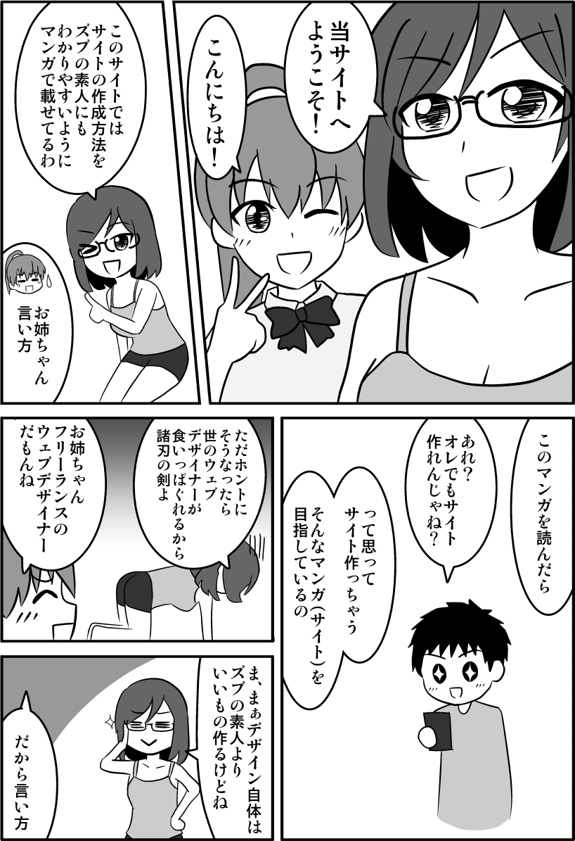
↓CSSやhtmlを楽しく学べるようにマンガを描きましたのでゼヒご覧ください↓

↑「副業してもう少し稼ぎたい!」というかたのために副業の方法も解説しています。
改行の不可
flexは子要素を改行させることができます。改行させる場合は「flex-wrap: wrap」を指定します。
tableはtdを改行できません。
子要素の幅
flexは子要素の幅の合計が親要素より小さいとき、小さいままです。
親要素より大きくかつ改行が許可されていない場合は自動で調整され親要素と一致します。
<style>
.example{
    display: flex;
    border: 1px solid #999;
    padding: 5px;
    background: #f2f2f2;
}
.example div{
    border: 1px solid #999;
    padding: 10px;
    background: #FFF;
    box-sizing: border-box;
}
</style>

<div class="example">
    <div>flex1</div>
    <div>flex2</div>
    <div>flex3</div>
    <div>flex4</div>
</div>
tableは一行のtdの幅の合計がtableの幅と一致していなくても、自動で調整されて一致されます。
| table1 | table2 | table3 | table4 |
<style>
.example2{
    width: 100%;
}
</style>

<table border="1" class="example2">
    <tr>
        <td>table1</td>
        <td>table2</td>
        <td>table3</td>
        <td>table4</td>
    </tr>
</table>
子要素のmarginの指定可不可
flexの子要素にはmarginを指定することができます。
<style>
.example3{
    display: flex;
    border: 1px solid #999;
    padding: 5px;
    background: #f2f2f2;
}
.example3 div{
    /*コレ*/margin: 20px;
    border: 1px solid #999;
    padding: 10px;
    background: #FFF;
    box-sizing: border-box;
}
</style>

<div class="example3">
    <div>flex1</div>
    <div>flex2</div>
    <div>flex3</div>
    <div>flex4</div>
</div>tdにはmarginを指定できません。
| table1 | table2 | table3 | table4 |
<style>
.example4 td{
    /*きかない*/margin: 20px;
}
</style>

<table border="1" class="example4">
    <tr>
        <td>table1</td>
        <td>table2</td>
        <td>table3</td>
        <td>table4</td>
    </tr>
</table>
行の決まり方
flexは子要素はすべて兄弟要素になっており、二行目以降を作るには子要素の幅によって決まります。
<style>
.example5{
    display: flex;
    flex-wrap: wrap;
}
.example5 div{
    border: 1px solid #999;
    padding: 10px;
    width: 25%;
    background: #FFF;
    box-sizing: border-box;
}
</style>

<div class="example5">
    <div>flex1</div>
    <div>flex2</div>
    <div>flex3</div>
    <div>flex4</div>
    <div>flex1</div>
    <div>flex2</div>
    <div>flex3</div>
    <div>flex4</div>
</div>tableはhtmlによって決まります。trで行を指定し、tdでマス(列)を指定します。
| table1 | table2 | table3 | table4 |
| table1 | table2 | table3 | table4 |
<table border="1" width="100%">
    <tr>
        <td>table1</td>
        <td>table2</td>
        <td>table3</td>
        <td>table4</td>
    </tr>
    <tr>
        <td>table1</td>
        <td>table2</td>
        <td>table3</td>
        <td>table4</td>
    </tr>
</table>
列の幅
flexは折り返されて二行目になった子要素の幅を変更できます。
そもそも「列」という認識がありません。
<div class="example5">
    <div style="width:30%;">flex1</div>
    <div style="width:20%;">flex2</div>
    <div style="width:40%;">flex3</div>
    <div style="width:10%;">flex4</div>
    <div style="width:20%;">flex1</div>
    <div style="width:40%;">flex2</div>
    <div style="width:40%;">flex3</div>
    <div style="width:100%;">flex4</div>
</div>
tableは列単位で幅が統一されます。widthを変えても無視されます。
| table1 | table2 | table3 | table4 |
| table1 | table2 | table3 | table4 |
<table border="1" width="100%">
    <tr>
        <td style="width:30%;">table1</td>
        <td style="width:20%;">table2</td>
        <td style="width:40%;">table3</td>
        <td style="width:10%;">table4</td>
    </tr>
    <tr>
        <td style="width:10%;">table1</td>
        <td style="width:20%;">table2</td>
        <td style="width:40%;">table3</td>
        <td style="width:30%;">table4</td>
    </tr>
</table>
CSSでの指定
flexは「display:flex」の指定が必須です。htmlだけでは作成できません。
tableはhtmlだけで形作ることができます。
結論
flexはレイアウトを組みたいときに利用しましょう。
tableは表(ひょう)を扱うときに使いましょう。
列の幅を統一させたいときも使えます。
htmlだけで横並びできるため簡易的な横並びのときに使ってもいいでしょう。
【まとめ】flexとtableの違い
| flex | table | |
|---|---|---|
| 目的 | レイアウト | 表 |
| 改行 | 可能 | 不可能 |
| 子要素の幅 | 100%以内なら任意 | 合計が親と一致 |
| 子要素のmargin | 可能 | 不可能 |
| 行の決まり方 | 子要素の幅によって決まる | htmlによって決まる |
| 列の幅 | 行によって変えられる | すべての行で同じ幅 |
| CSSでの指定 | 必須 | 不要 |
| 結論 | レイアウトを組みたいとき | 表 列の幅を自動で揃えたいとき 簡易な横並べをしたいとき |
以上、flexとtableの違いでした。
「この記事の内容がよくわからなかった…」「なんかうまくいかなかった…」というかたは下記記事↓でhtmlとCSSの基本を学びましょう。
わからないまま突き進むより基本を学ぶのが結局近道です。