CSSだけで長い矢印アイコンの作り方【コピペでOK】
ネットで調べると▲や>といった三角だけの短い矢印アイコンの作り方は多数紹介されています。しかし「→」のような長い矢印アイコンの作り方は意外と見つかりません。
ここでは「→」のような長い矢印アイコンの作り方を説明します。
太長い矢印と細長い矢印を上下左右用意しました。
以下のCSSをそのままコピペしてもOKですが、太さや長さはあなたの目的に合わせて変えましょう。
しかし、そうすると矢印の頭と棒の部分が離れてしまいます。
離れないようにするためにtopとleftの計算方法も記載します。
※a,b,cは自由に定義してください。
その後、位置調整するときはafter,beforeそれぞれのtop,leftに同じ数字をたしていきましょう。
太長い左矢印
html
<div class="boldleft"></div>CSS
.boldleft{
    position: relative;
}
.boldleft::before{
    content: "";
    display: block;
    position: absolute;
    top: 12px;
    left: 40px;
    width: 100px;
    height: 16px;
    background: #666;
}
.boldleft::after{
    content: "";
    display: block;
    position: absolute;
    top: 0;
    left: 0;
    width: 0;
    height: 0;
    border: 20px solid;
    border-color: transparent #666 transparent transparent;
}
計算方法
.boldleft::afterのborder-width=a
.boldleft::beforeのheight=b
.boldleft::beforeのtop=a-(b/2)
.boldleft::beforeのleft=a×2
CSSやhtmlの基本をしっかり理解すると、この記事の内容もより理解できるようになりますよ。
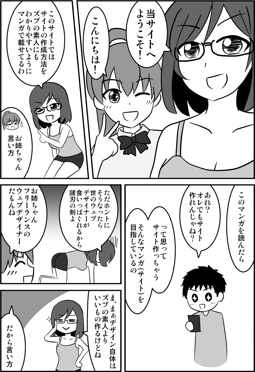
↓CSSやhtmlを楽しく学べるようにマンガを描きましたのでゼヒご覧ください↓

↑「副業してもう少し稼ぎたい!」というかたのために副業の方法も解説しています。
太長い右矢印
html
<div class="boldright"></div>CSS
.boldright{
    position: relative;
}
.boldright::before{
    content: "";
    display: block;
    position: absolute;
    top: 12px;
    left: 0px;
    width: 100px;
    height: 16px;
    background: #666;
}
.boldright::after{
    content: "";
    display: block;
    position: absolute;
    top: 0;
    left: 100px;
    width: 0;
    height: 0;
    border: 20px solid;
    border-color: transparent transparent transparent #666;
}
計算方法
.boldright::afterのborder-width=a
.boldright::beforeのheight=b
.boldright::beforeのwidth=c
.boldright::beforeのtop=a-(b/2)
.boldright::afterのleft=c
太長い上矢印
html
<div class="boldtop"></div>CSS
.boldtop{
    position: relative;
}
.boldtop::before{
    content: "";
    display: block;
    position: absolute;
    top: 40px;
    left: 12px;
    width: 16px;
    height: 100px;
    background: #666;
}
.boldtop::after{
    content: "";
    display: block;
    position: absolute;
    top: 0;
    left: 0;
    width: 0;
    height: 0;
    border: 20px solid;
    border-color: transparent transparent #666 transparent;
}
計算方法
.boldtop::afterのborder-width=a
.boldtop::beforeのwidth=b
.boldtop::beforeのtop=a-(b/2)
.boldtop::beforeのleft=a×2
太長い下矢印
html
<div class="boldbottom"></div>CSS
.boldbottom{
    position: relative;
}
.boldbottom::before{
    content: "";
    display: block;
    position: absolute;
    top: 0px;
    left: 12px;
    width: 16px;
    height: 100px;
    background: #666;
}
.boldbottom::after{
    content: "";
    display: block;
    position: absolute;
    top: 100px;
    left: 0;
    width: 0;
    height: 0;
    border: 20px solid;
    border-color: #666 transparent transparent transparent;
}
計算方法
.boldtop::afterのborder-width=a
.boldtop::beforeのwidth=b
.boldtop::beforeのhight=c
.boldtop::afterのtop=c
.boldtop::beforeのleft=a-(b/2)
細長い左矢印
html
<div class="thinleft"></div>CSS
.thinleft{
    position: relative;
}
.thinleft::before{
    content: "";
    display: block;
    position: absolute;
    top: 11px;
    left: -2px;
    width: 100px;
    height: 2px;
    background: #666;
}
.thinleft::after{
    content: "";
    display: block;
    position: absolute;
    top: 0;
    left: 0;
    width: 20px;
    height: 20px;
    border: 2px solid;
    border-color: transparent transparent #666 #666;
    transform: rotate(45deg);
}
計算方法
.thinleft::afterのborder-width=.thinleft::beforeのheight=a
.thinleft::afterのwidth=height=b
.thinleft::beforeのtop=(a+b)/2
.thinleft::beforeのleft=-a
細長い右矢印
html
<div class="thinright"></div>CSS
.thinright{
    position: relative;
}
.thinright::before{
    content: "";
    display: block;
    position: absolute;
    top: 11px;
    left: 0px;
    width: 100px;
    height: 2px;
    background: #666;
}
.thinright::after{
    content: "";
    display: block;
    position: absolute;
    top: 0;
    left: 72px;
    width: 20px;
    height: 20px;
    border: 2px solid;
    border-color: transparent transparent #666 #666;
    transform: rotate(-135deg);
}
計算方法
.thinright::afterのborder-width=.thinleft::beforeのheight=a
.thinright::afterのwidth=height=b
.thinright::beforeのwidth=c
.thinright::beforeのtop=(a+b)/2
.thinright::afterのleft=c-(b×1.4)
ちなみに1.4は√2のことです。
細長い上矢印
html
<div class="thintop"></div>CSS
.thintop{
    position: relative;
}
.thintop::before{
    content: "";
    display: block;
    position: absolute;
    top: -2px;
    left: 11px;
    width: 2px;
    height: 100px;
    background: #666;
}
.thintop::after{
    content: "";
    display: block;
    position: absolute;
    top: 0;
    left: 0;
    width: 20px;
    height: 20px;
    border: 2px solid;
    border-color: transparent transparent #666 #666;
    transform: rotate(135deg);
}
計算方法
.thintop::afterのborder-width=.thintop::beforeのwidth=a
.thintop::afterのwidth=height=b
.thintop::beforeのtop=-a
.thintop::beforeのleft=(a+b)/2
細長い下矢印
html
<div class="thinbottom"></div>CSS
.thinbottom{
    position: relative;
}
.thinbottom::before{
    content: "";
    display: block;
    position: absolute;
    top: 0px;
    left: 11px;
    width: 2px;
    height: 100px;
    background: #666;
}
.thinbottom::after{
    content: "";
    display: block;
    position: absolute;
    top: 72px;
    left: 0;
    width: 20px;
    height: 20px;
    border: 2px solid;
    border-color: transparent transparent #666 #666;
    transform: rotate(-45deg);
}
計算方法
.thinbottom::afterのborder-width=.thinbottom::beforeのwidth=a
.thinbottom::afterのwidth=height=b
.thinbottom::beforeのheight=c
.thinbottom::afterのtop=c-(b×1.4)
.thinbottom::beforeのleft=(a+b)/2
まとめ
上下左右の太長い矢印と細長い矢印の作り方を説明しました。
応用がきくように計算方法も掲載しました。
ぜひ使ってみてください。
以上、CSSだけで長い矢印アイコンの作り方でした。
「この記事の内容がよくわからなかった…」「なんかうまくいかなかった…」というかたは下記記事↓でhtmlとCSSの基本を学びましょう。
わからないまま突き進むより基本を学ぶのが結局近道です。