【html】tableで入力formのlabelとinputを横並びにする方法
formを作るときlabelで囲った項目名を左に、inputの入力項目を右に設置することが多いかと思います。
また、そのlabelとinputを間隔や改行の調整もしたいですよね。
今回はhtmlのformにてlabelとinputを横並びにする方法を説明します。
目次
サンプル(完成イメージ)
下記のようなフォームを作成してみましょう。スマホ対応もしています。ブラウザ幅を狭めるとスマホ表示を確認できます。
html
<form>
    <table>
        <tr>
            <th class="hissu"><label>お名前</label></th>
            <td><input type="text"></td>
        </tr>
        <tr>
            <th class="ninni"><label>電話番号</label></th>
            <td><input type="text"><span class="attention">※連絡のつく番号をお願いします</span></td>
        </tr>
        <tr>
            <th class="ninni"><label>年齢</label></th>
            <td><input type="text" class="smallinput">歳</td>
        </tr>
        <tr>
            <th class="hissu"><label>内容</label></th>
            <td><textarea></textarea></td>
        </tr>
    </table>
    <div class="buttonwrap">
        <input type="button" value="戻る">
        <input type="submit" value="送信">
    </div>
</form>
CSS
form table{
    border-spacing: 0;
}
form td{
    padding: 10px;
    border-bottom: 1px solid #EEE;
}
form th{
    padding: 15px;
    border-bottom: 1px solid #EEE;
    text-align: left;
    font-weight: normal;
    vertical-align: top;
    width: 5em;
}
.hissu,.ninni{
    padding-right: 4em;
    position: relative;
}
.hissu::after,.ninni::after{
    content: "必須";
    display: inline-block;
    position: absolute;
    right: 10px;
    top: 15px;
    border: 1px solid #CCC;
    padding: 0 5px;
    font-size: 85%;
    background: #d40000;
    color: #FFF;
}
.ninni::after{
    content: "任意";
    background: #d2e5ff;
    color: #333;
}
form input[type="text"],form textarea{
    background: #f2f2f2;
    border: 1px solid #999;
    margin: 0 5px;
    width: 300px;
    padding: 5px;
    box-sizing: border-box;
}
.attention{
    display: inline-block;
}
.smallinput{
    width: 100px !important;
}
.buttonwrap{
    text-align: center;
    padding: 20px 0;
}
form input[type="button"],form input[type="submit"]{
    display:inline-block;
    background:#d13415;
    padding:10px;
    text-align:center;
    color:#FFF;
    margin:5px;
    border:1px solid;
    cursor:pointer;
    width: 150px;
}
form input[type="button"]{
    background: #f2f2f2;
    color: #333;
    border: none;
}
@media (max-width:500px){
    form table,form tr,form th,form td{
        display: block;
    }
    form th{
        width: auto;
        border-bottom: none;
        padding: 13px 10px 0 5em;
    }
    .hissu::after,.ninni::after{
        right: auto;
        left: 15px;
    }
    form input[type="text"],form textarea{
        width: calc(100% - 10px);
    }
}
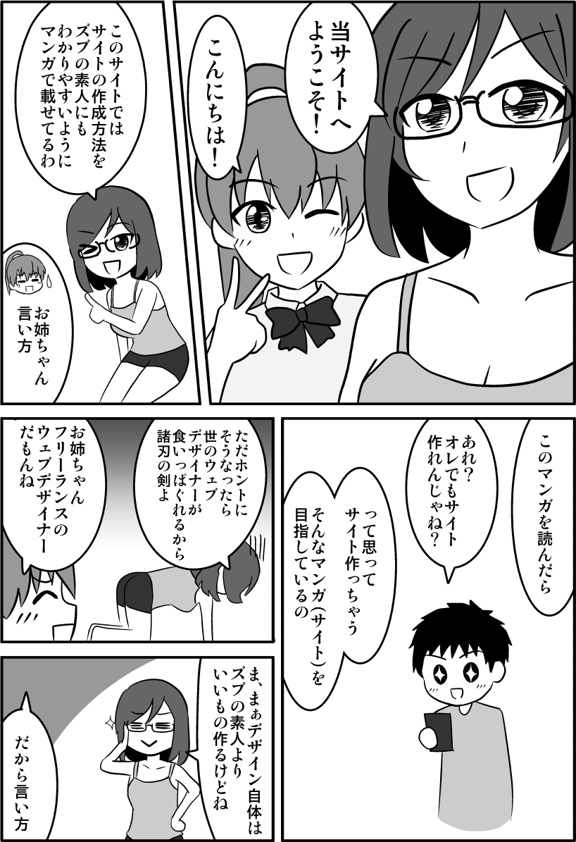
CSSやhtmlの基本をしっかり理解すると、この記事の内容もより理解できるようになりますよ。
↓CSSやhtmlを楽しく学べるようにマンガを描きましたのでゼヒご覧ください↓

↑「副業してもう少し稼ぎたい!」というかたのために副業の方法も解説しています。
labelとinputの横並べはtable
formでlabelとinputを横並べするにはtableがオススメです。
tableを使うことで改行させず、かつきれいに揃えることができます。
tableは2列にします。左のマスはthに、右のマスはtdにするとCSSの指定が楽になります。
<table>
    <tr>
        <th><label>お名前</label></th>
        <td><input type="text"></td>
    </tr>
    <tr>
        <th><label>電話番号</label></th>
        <td><input type="text"></td>
    </tr>
    <tr>
        <th><label>年齢</label></th>
        <td><input type="text"></td>
    </tr>
    <tr>
        <th><label>内容</label></th>
        <td><textarea></textarea></td>
    </tr>
</table>
ちなみにlabelは任意です。
labelを設定する場合idとforで紐づけすることをオススメします。
関連記事はこちら↓
間隔の調整はpadding
間隔の調整にはthやtdに対し「padding」を使いましょう。
また、tableの隙間をなくすために「border-spancing:0」も指定しましょう。
あとはデザインとして見やすいよう線を入れたり、入れなかったりします。
form table{
    border-spacing: 0;
}
form td{
    padding: 10px;
    border-bottom: 1px solid #EEE;
}
form th{
    padding: 15px;
    border-bottom: 1px solid #EEE;
    text-align: left;
    font-weight: normal;
    vertical-align: top;
    width: 5em;
}
「必須」「任意」の表示は::after
項目が必須なのか任意なのか表示させると親切です。
「必須」「任意」は文字が固定であるため「::after(またはbefore)」を利用し記号のように扱うことをオススメします。
.hissu,.ninni{
    padding-right: 4em;
    position: relative;
}
.hissu::after,.ninni::after{
    content: "必須";
    display: inline-block;
    position: absolute;
    right: 10px;
    top: 15px;
    border: 1px solid #CCC;
    padding: 0 5px;
    font-size: 85%;
    background: #d40000;
    color: #FFF;
}
.ninni::after{
    content: "任意";
    background: #d2e5ff;
    color: #333;
}
あとはhtmlのthに「class="hissu"」または「class="ninni"」を設定しましょう。
inputとinput、文字の横並べはdisplay:inline-block
input同士や、inputと文字を横並べするときはdisplay:inline-blockがオススメです。
文章が長いときは自動的に改行され読みやすくなるというメリットがあります。
inputの前後にmarginを指定しておくと間隔を確保できます。
form input[type="text"],form textarea{
    background: #f2f2f2;
    border: 1px solid #999;
    margin: 0 5px;
    width: 300px;
    padding: 5px;
    box-sizing: border-box;
}
.attention{
    display: inline-block;
}
.smallinput{
    width: 100px !important;
}
1文字か2文字の単位の場合はCSSで調整せずそのまま表示でもいいでしょう。
またその項目のinputは小さめにしておくと単位とinputが改行されずにすみます。
submitボタンの横並べはdisplay:inline-block
「戻る」「送信」などのsubmitボタンを横並べするときはdisplay:inline-blockが便利です。
divで囲って「text-aling:center」を指定することで中央寄せにもできます。
また、「送信」を押すことがおおく、「戻る」を間違って押してしまう可能性を下げるため、「戻る」ボタンを目立たないようにする工夫もしています。
html
<div class="buttonwrap">
    <input type="button" value="戻る">
    <input type="submit" value="送信">
</div>
CSS
.buttonwrap{
    text-align: center;
    padding: 20px 0;
}
form input[type="button"],form input[type="submit"]{
    display:inline-block;
    background:#d13415;
    padding:10px;
    text-align:center;
    color:#FFF;
    margin:5px;
    border:1px solid;
    cursor:pointer;
    width: 150px;
}
form input[type="button"]{
    background: #f2f2f2;
    color: #333;
    border: none;
}
ボタンの調整に関する記事はこちら↓
スマホ対応の縦並べ(改行させる)
スマホで横並びだとかえって見づらくなることがあります。
スマホでは、table,tr,th,tdにdisplay:blockを指定し、縦並べにしています。
@media (max-width:500px){
    form table,form tr,form th,form td{
        display: block;
    }
    form th{
        width: auto;
        border-bottom: none;
        padding: 13px 10px 0 5em;
    }
    .hissu::after,.ninni::after{
        right: auto;
        left: 15px;
    }
    form input[type="text"],form textarea{
        width: calc(100% - 10px);
    }
}
あとは間隔や位置・線などを調節し見やすくします。
これで完成です。
まとめ
- labelとinputの横並べはtableを使う
- 間隔の調整はpaddingで調整
- 「必須」「任意」の表示は::afterを設置
- inputとinput、文字の横並べはdisplay:inline-block
- submitボタンの横並べはdisplay:inline-block
- スマホ対応の縦並べ(改行させる)
以上、htmlのformにてlabelとinputを横並びにする方法でした。
「この記事の内容がよくわからなかった…」「なんかうまくいかなかった…」というかたは下記記事↓でhtmlとCSSの基本を学びましょう。
わからないまま突き進むより基本を学ぶのが結局近道です。